CONCEPT STATEMENT
Wayward is an extreme travel lifestyle publication that pushes the limits of what it means to be a tourist and a citizen of the world. Wayward encourages travelers to explore off-the-beaten-path destinations and discover the untold stories they hold. Seeking to make travel more accessible, sustainable, and fulfilling, Wayward provides tips and tidbits from experienced immigrants, expatriates, and nomads who have embraced the whole world as somewhere to call home. Wayward is for the curious, wandering soul who seeks to find belonging, not in where they reside, but in shared humanity.
WORDMARK
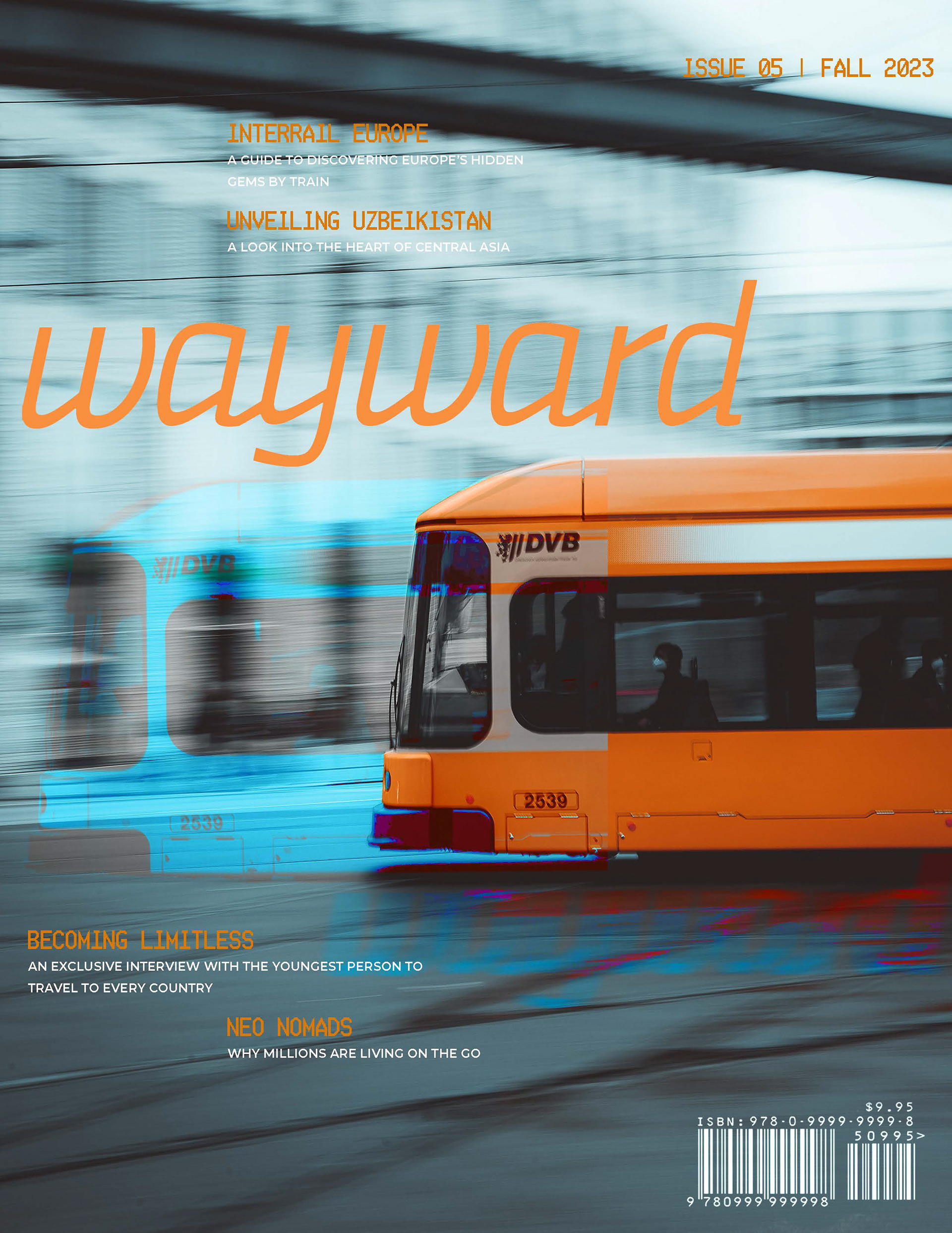
The branding process for wayward began with the creation of the wordmark. I looked for base typefaces that were a bit rough-and-tumble, but had potential for whimsy and movement. I settled on the Ways Variable Italic as a base, and created custom ligatures to connect the a's to their following letters to mimic a stop-and go motion.
ANIMATED WORDMARK
BRANDING
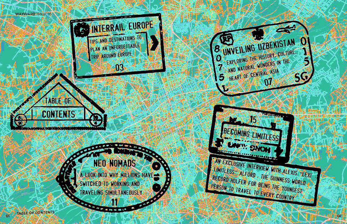
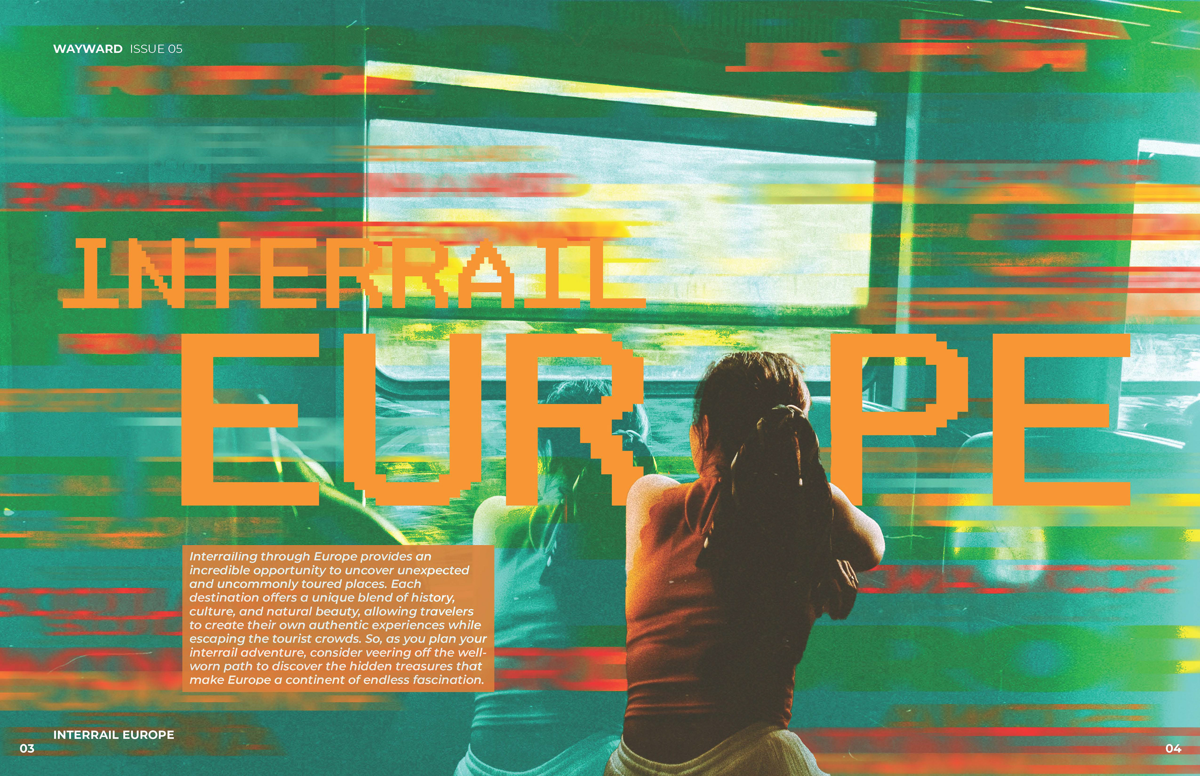
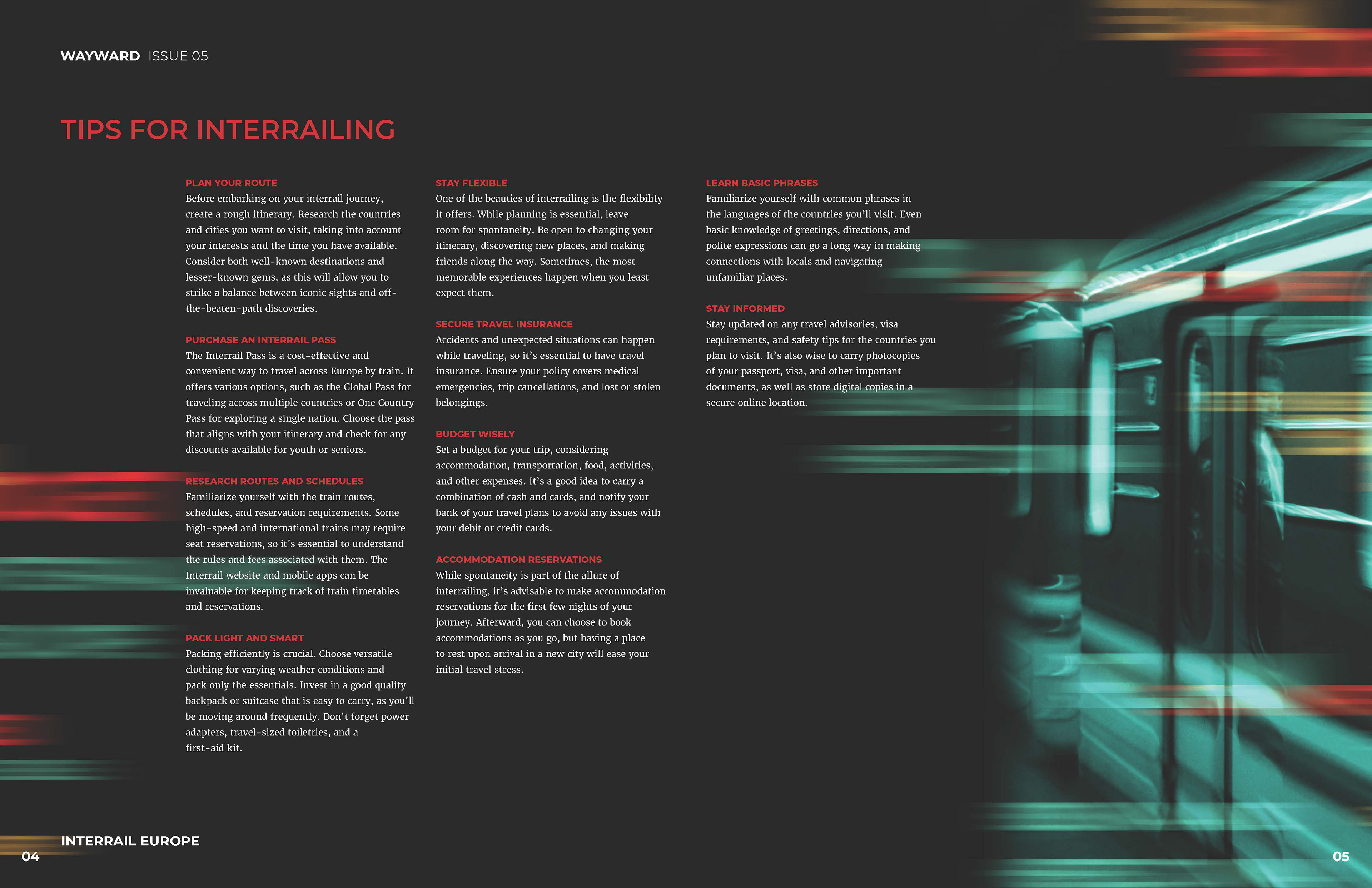
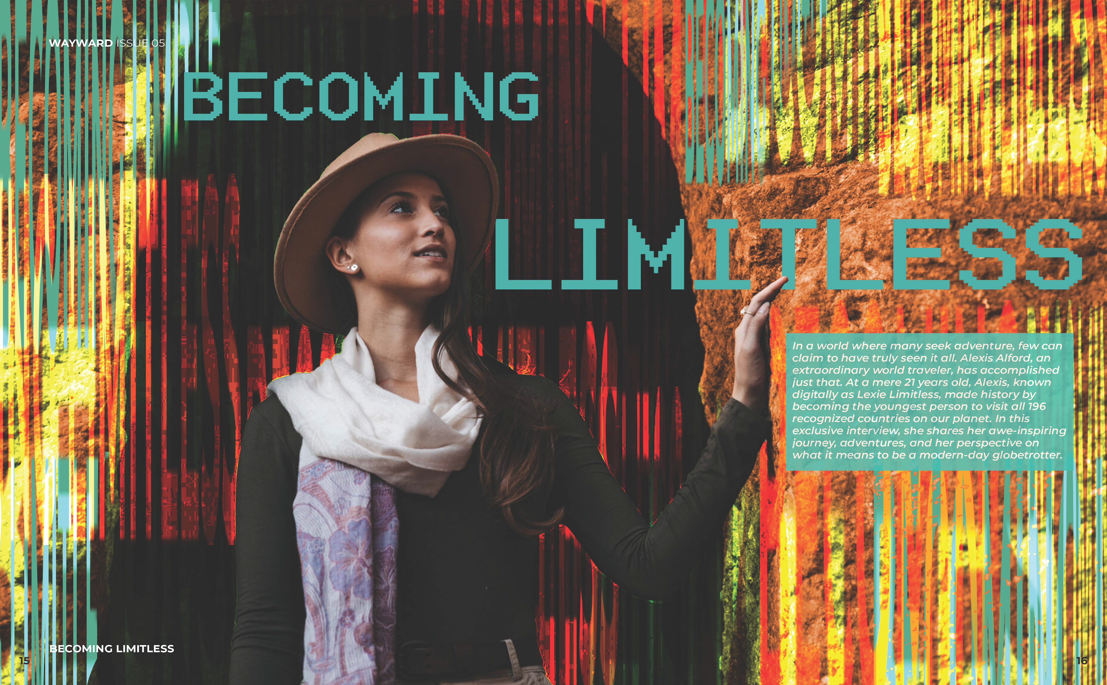
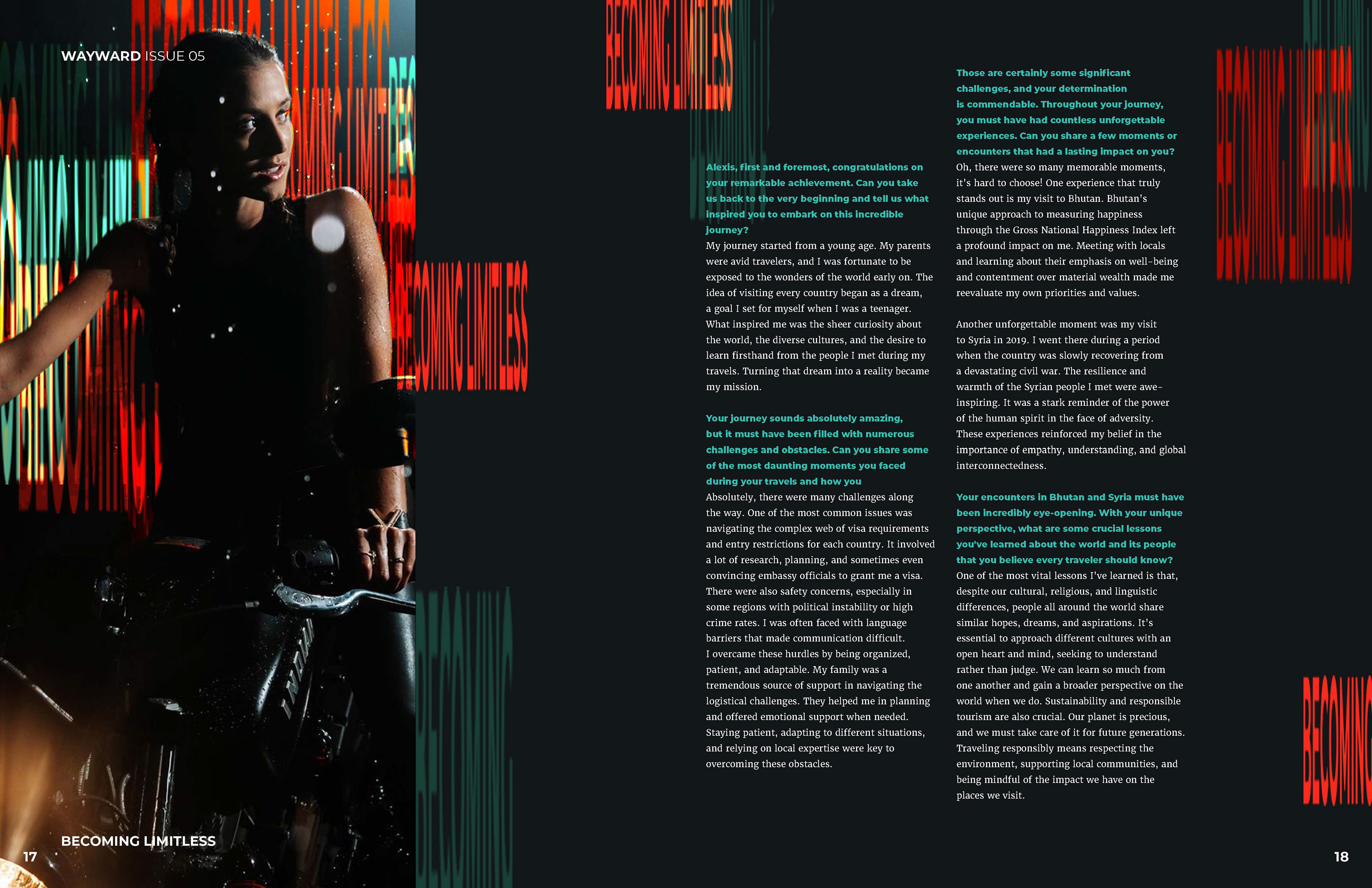
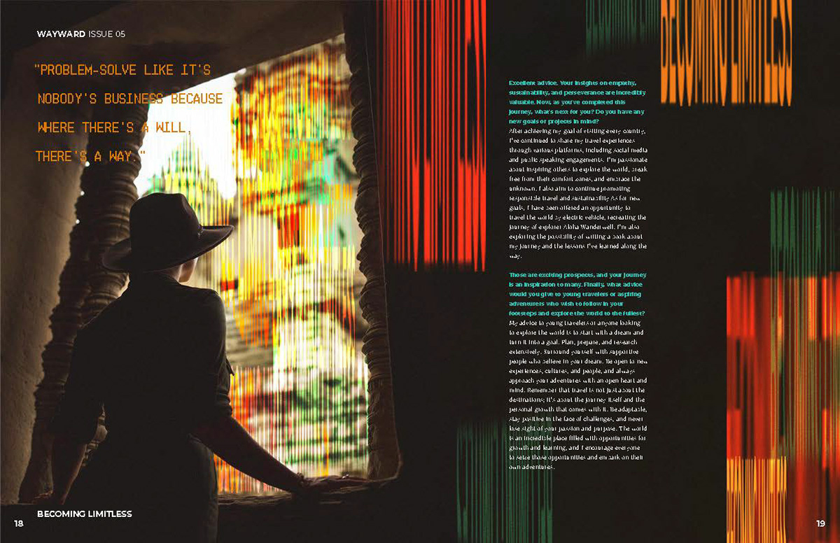
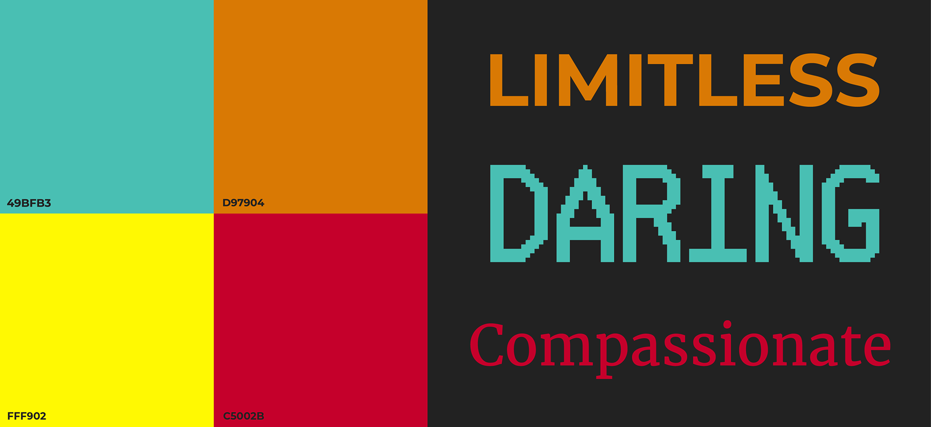
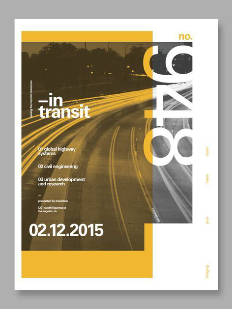
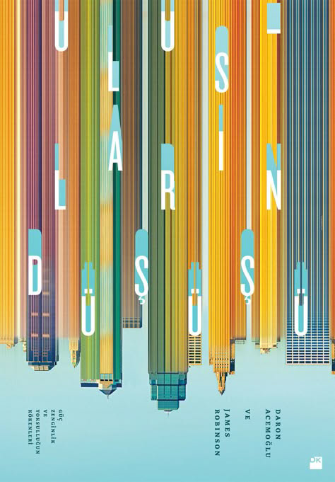
By pairing a bold, bright color palette with a subtle typographic palette, balance is struck between the excitement and the realism of travel. Type is set on dark backgrounds to allow bold typographic texture to bleed from images and pull readers' eyes through its contents.




OUTCOME
